Unbox Your Phone!

This ad is an ad for the Samsung Galaxy S8+. I am a true Samsung fan and have been using Samsung phones for years. Each year Samsung comes out with more and more amazing products. This ad by Samsung shows that the phones are really able to be used everywhere. I had a lot of fun designing a new ad to fit into the same “Ad Campaign”. I found the ad here:

https://media.idownloadblog.com/wp-content/uploads/2017/05/Samsung-Galaxy-S8-Unbox-your-phone-teaser-000.jpg

Original Ad Design
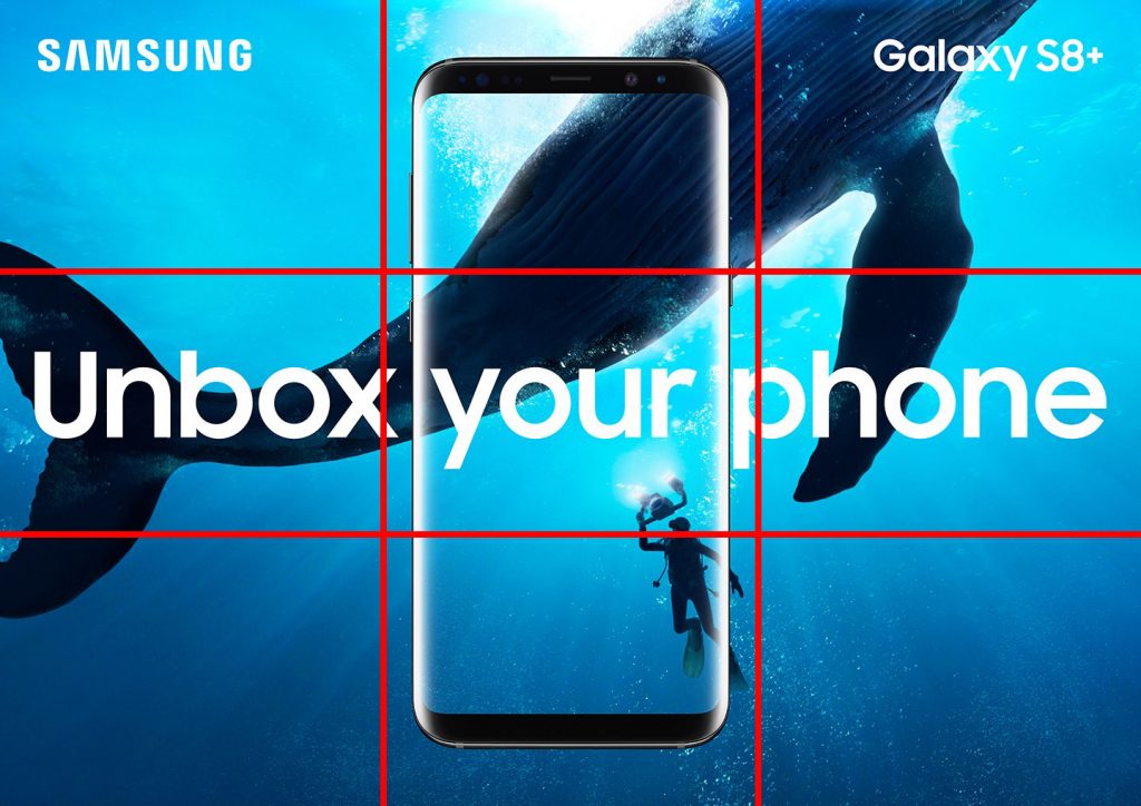
I really like the design of this ad, for me it really caught my attention and while being a more creative ad, still makes it clear what the ad is about. This ad has a fantastic use of the rule of thirds. The wale is taking up 2/3 of the page, centered on one of the thirds mark. The divers face is right at the lower third mark, helping to bring your attention to a much smaller part of the photo. The rest of the design is mostly centered adding some symmetry to the asymmetrical image behind.

Original Ad Color
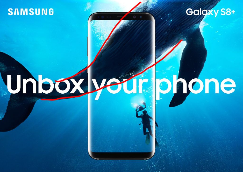
This add is using a very strong blue color theme, all of the image is different shades of blue, with the reflection on the phone and the text popping a bright white. The contrast from the body of the wale to the water brings your eye to the start of the text like an arrow. The diver and the wale being a much darker color than the water around them really helps them to pop and bring attention to them.

Original Ad Typography
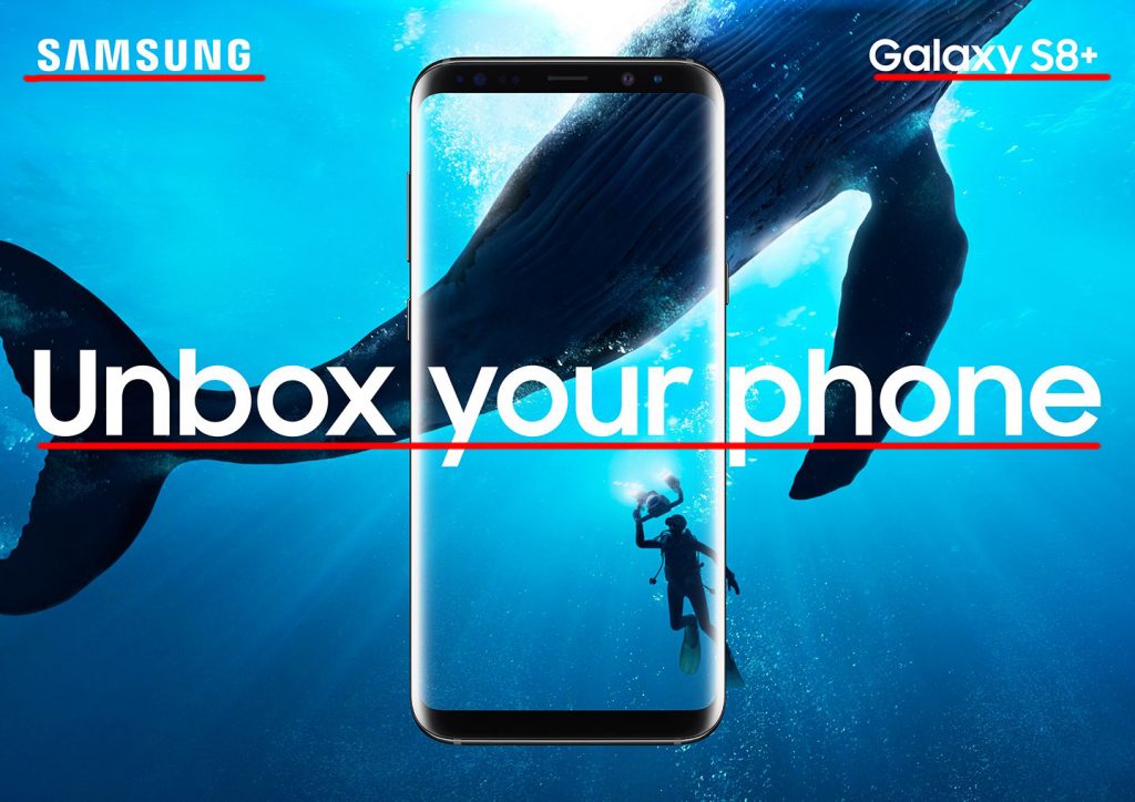
This ad uses a single typeface, however, there is some contract in the size of the font. Both of the upper words are smaller while the main phrase is much larger, making it clear this is the desired point for your eye to follow.


New Ad Design

My new add also has a good use of the rule of thirds, the flower is kept to the right most third. The eye of the bird is sitting at a third line also. The flower and the bird have a high contrast from the background. making them a main focus. The words show groupings based on location, the logo and the device name are in the top corners grouping them in my mind, While the main text is larger and aligned differently making it another group.

New Ad Color
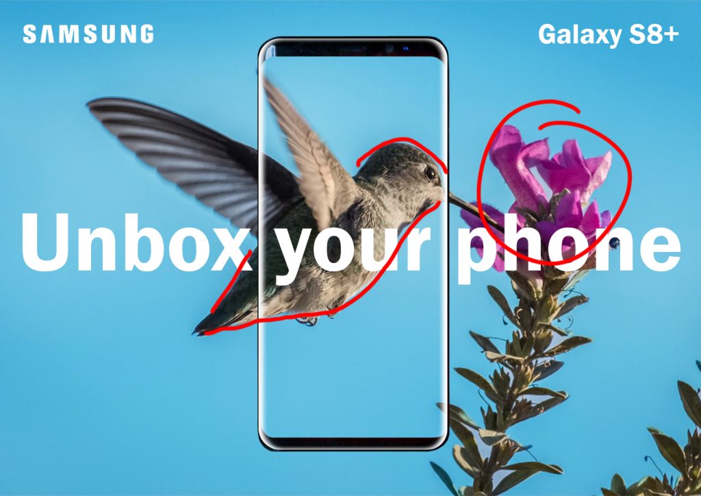
This color follows with a largely blue color scheme, with the flower adding a pop of color to bring your attention in. I did adjust the color of the background to a blue that matched closer to the original ad to make them look more like each other. There is also a high contrast between the dark of the bird and flower, and the light of the sky, making the bird and flower the focus point. The white of the words and the reflection on the phone also pop out and bring attention there.

New Ad Typography
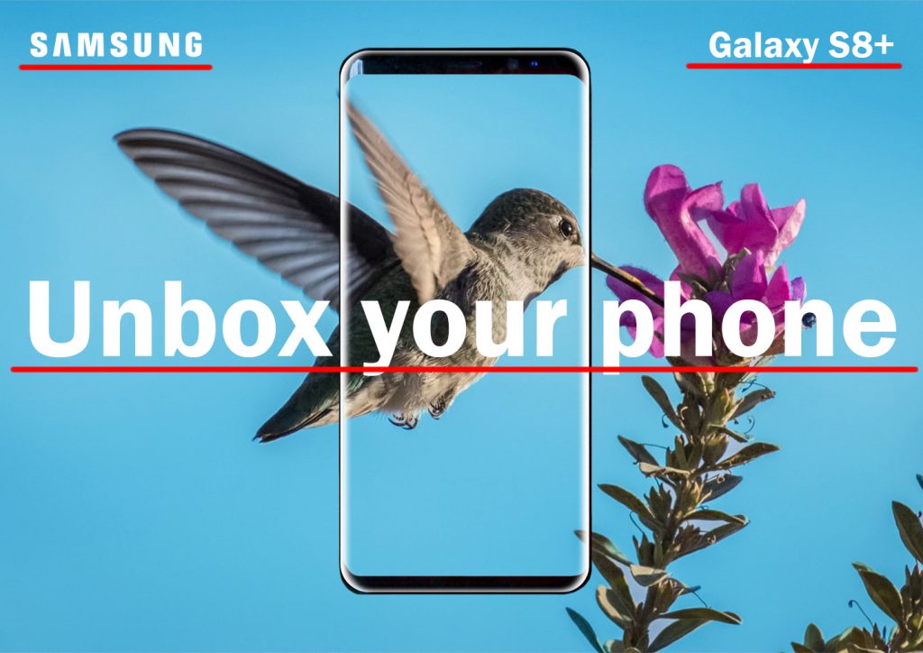
I used as close a typeface as I could find for the main text and the device text though it does have some contrast to the Samsung logo, unlike the original ad. Like the original ad, the different section s of text are grouped based on location. The main text in the middle is larger making it clear it is meant to be the focal point.


Conclusion
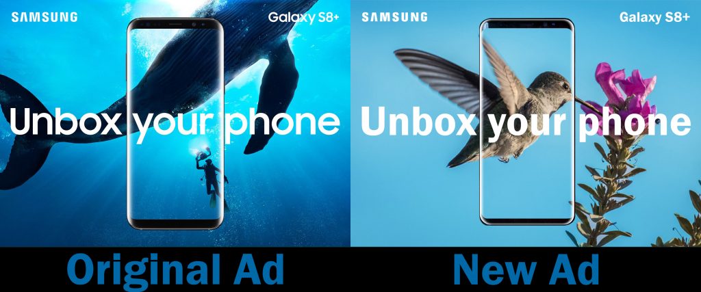
In conclusion, the new ad I created matches well with the original ad as it follows the same color scheme, and the typefaces are very similar. I wanted to keep the background photo as a nature photo but make it a little different by bringing it above land instead of underwater. The text is definitely the main thing that unites the 2 ads and the photos, while similar, offer a good contrast to each other.

Up Your Kitchen Game!

This article is displayed in the MyNorth Real Estate magazine for the year 2020. I discovered the article on magzter.com, I website offering a good selection of free digital magazines (article link). This article was written by Cara McDonald, photos courtesy of ETNA. This article had a fantastic layout with contrasting typography, and great photos utilizing depth of field and rule of thirds.


Typeface Categories

This article utilizes a san serif typeface for the headlines and sub-headlines, and an oldstyle type face for all of the body text. The old style type is very readable in the large paragraphs, and the san serif headlines bring in some good contrast.

Typeface Contrast

As mentioned above there is a contrast in the typefaces, san serif versus old style, but a lot of the contract is created by the color and size. The main headline is very large, popping out from the rest of the headlines and text. The other headlines in the article are also that different color, much lighter than the standard black text, as well as bolded to stand out. The sub-headlines do not have the same color contrast, they instead just have the bolded letters while still being the sanserif typeface and black.

Photography

The 2 photographs in this article each demonstrate a different principle of photography. The top photo demonstrates depth of field, with the focus being on the pot and sink, and the background of the kitchen blurred out. The lower photo demonstrates the rule of thirds with the counter, and the window/landscape outside the window being at the thirds mark.


Possible Alternate Images

This photo demonstrates the same rule of thirds at the second photo, with the counter, and the upper cabinets at the thirds marks.

This photo demonstrates, like the first in the article, demonstrates depth of field. The onions and garlic are focused while the rest of the kitchen is blurred.

This photo also demonstrates depth of field with the pot in focus as the main object, and the rest of the kitchen blurred out.


Conclusion

In conclusion, this ad is done very well to bring your attention to the article and make the design interesting. There is fantastic contract in the type, both in style and color. The photos also demonstrate some very important principles of photography, rule of thirds and depth of field. It instantly brought my attention to the page and made me want to read it. I also like that they kept the colors in the photos along the same color scheme with the accent color in the text.

Redefine Family Time!

The focus of this Reverse Engineer project is to analyze the use of contrast, repetition, alignment, proximity and color in professionally produced materials.

This ad was created by Ruby’s Inn, a hotel in Bryce canyon. I found this popup Ad on KSL.com. This ad caught my attention right away, it may seem a little messy at first but upon close inspection, everything is perfectly placed and styled to assist with the entire overall design.


Contrast

This ad demonstrates a lot of contrast which is what caught my eye the most at first glance. The transitions between each image in this ad offers high contrast in color making it easy to find where each image ends and the next begins. The text in this ad also provides contrast. Each section includes a different type of text the first Serif, then script, lastly san-serif. The contrast really brings your eye to the ad and catches attention.

Repetition

This ad demonstrates repetition first by using the same symbol throughout. This arrow symbol is used across the design and keeps your eye moving across the design. The text also shows some repetition, while each section of text is a very different font, the line weight of all of the test is very similar creating repetition.

Alignment

This ad demonstrates alignment in a couple of ways. The majority of the text is aligned vertically in the center of the ad, and horizontally on the right of its section. The only section that does not follow this rule is the last. the text in the last section is horizontally centered, unlike the rest. This adds a bit more contract to the ad.

Proximity

This ad demonstrates proximity with the related texts grouped, as well as in the same typeface. The first 2 sections are nearby creating proximity, however the design of the typeface created some extra separation there. To me, this helps to highlight the words “family time” making them more important than the rest of the text while still keeping it connected. The text in the last section is not related to the first to section very much which is why it is separated both by alignment and proximity.

Color

Much of the contrast in this ad is created by color. There are striking differences in color around the text to make sure it is visible and brings your eye to it. Each section of the ad also has its own color theme that helps to follow into the next section. The first section is very warm, using reds and yellows. The second section has a little bit of the reds and yellows but adds some blues and oranges into the mix. The third section is focused on blues and oranges. That middle section really helps to bring the 2 entirely different sections together.


Conclusion

This ad uses each of these elements in unique ways that bring attention to the ad and direct your eyes across the ad. Many of these elements are intertwined and used in several ways to unify the design. This really shows that each of these elements by themselves is important, however, they are really successful when used as a whole, all together.