This article is displayed in the MyNorth Real Estate magazine for the year 2020. I discovered the article on magzter.com, I website offering a good selection of free digital magazines (article link). This article was written by Cara McDonald, photos courtesy of ETNA. This article had a fantastic layout with contrasting typography, and great photos utilizing depth of field and rule of thirds.
Typeface Categories
This article utilizes a san serif typeface for the headlines and sub-headlines, and an oldstyle type face for all of the body text. The old style type is very readable in the large paragraphs, and the san serif headlines bring in some good contrast.
Typeface Contrast
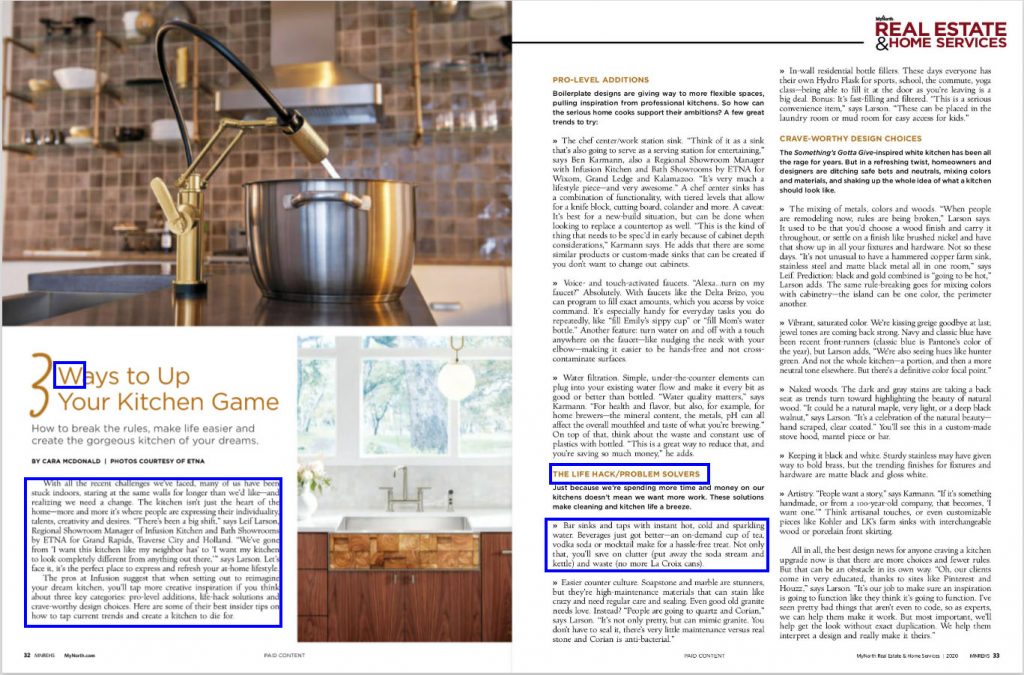
As mentioned above there is a contrast in the typefaces, san serif versus old style, but a lot of the contract is created by the color and size. The main headline is very large, popping out from the rest of the headlines and text. The other headlines in the article are also that different color, much lighter than the standard black text, as well as bolded to stand out. The sub-headlines do not have the same color contrast, they instead just have the bolded letters while still being the sanserif typeface and black.
Photography
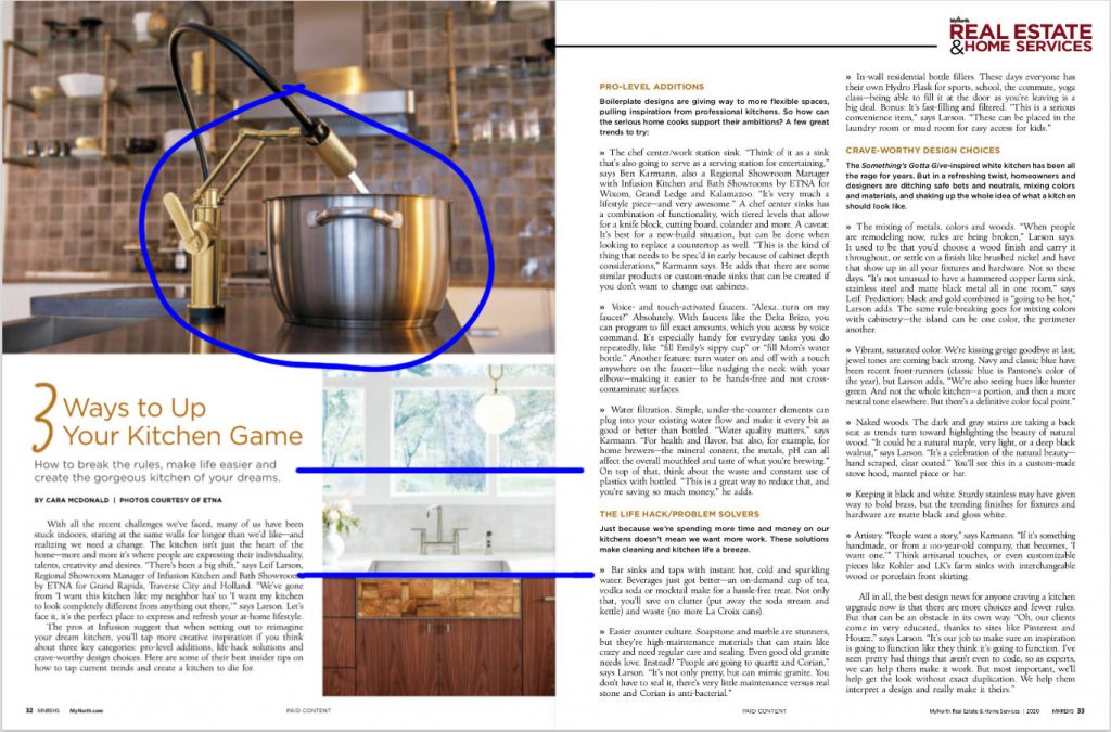
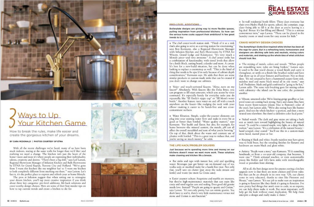
The 2 photographs in this article each demonstrate a different principle of photography. The top photo demonstrates depth of field, with the focus being on the pot and sink, and the background of the kitchen blurred out. The lower photo demonstrates the rule of thirds with the counter, and the window/landscape outside the window being at the thirds mark.
Possible Alternate Images
This photo demonstrates the same rule of thirds at the second photo, with the counter, and the upper cabinets at the thirds marks.
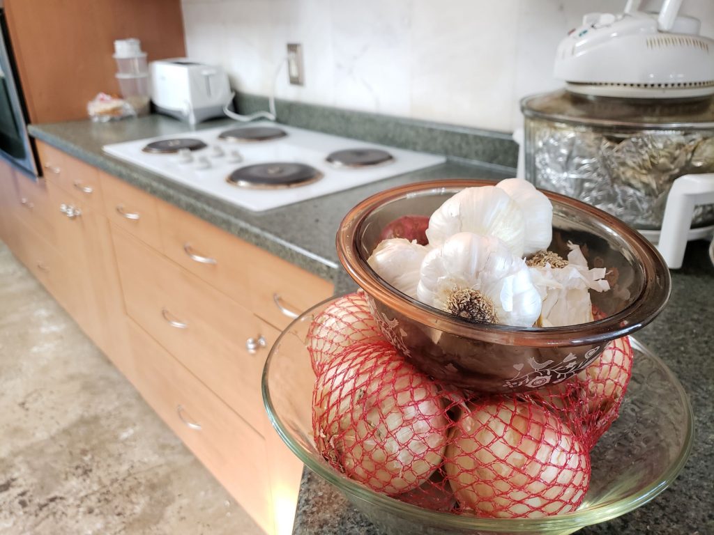
This photo demonstrates, like the first in the article, demonstrates depth of field. The onions and garlic are focused while the rest of the kitchen is blurred.
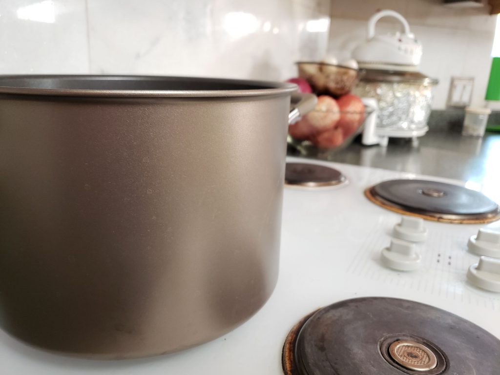
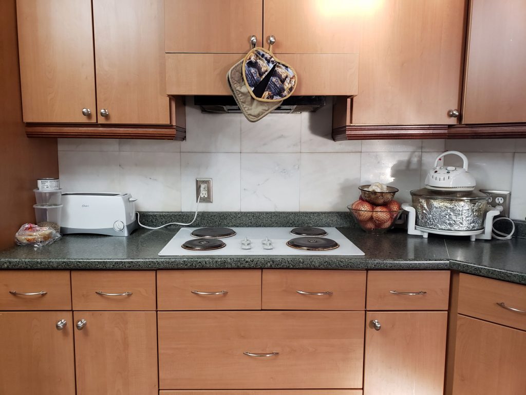
This photo also demonstrates depth of field with the pot in focus as the main object, and the rest of the kitchen blurred out.
Conclusion
In conclusion, this ad is done very well to bring your attention to the article and make the design interesting. There is fantastic contract in the type, both in style and color. The photos also demonstrate some very important principles of photography, rule of thirds and depth of field. It instantly brought my attention to the page and made me want to read it. I also like that they kept the colors in the photos along the same color scheme with the accent color in the text.