This ad is an ad for the Samsung Galaxy S8+. I am a true Samsung fan and have been using Samsung phones for years. Each year Samsung comes out with more and more amazing products. This ad by Samsung shows that the phones are really able to be used everywhere. I had a lot of fun designing a new ad to fit into the same “Ad Campaign”. I found the ad here:
https://media.idownloadblog.com/wp-content/uploads/2017/05/Samsung-Galaxy-S8-Unbox-your-phone-teaser-000.jpg
Original Ad Design
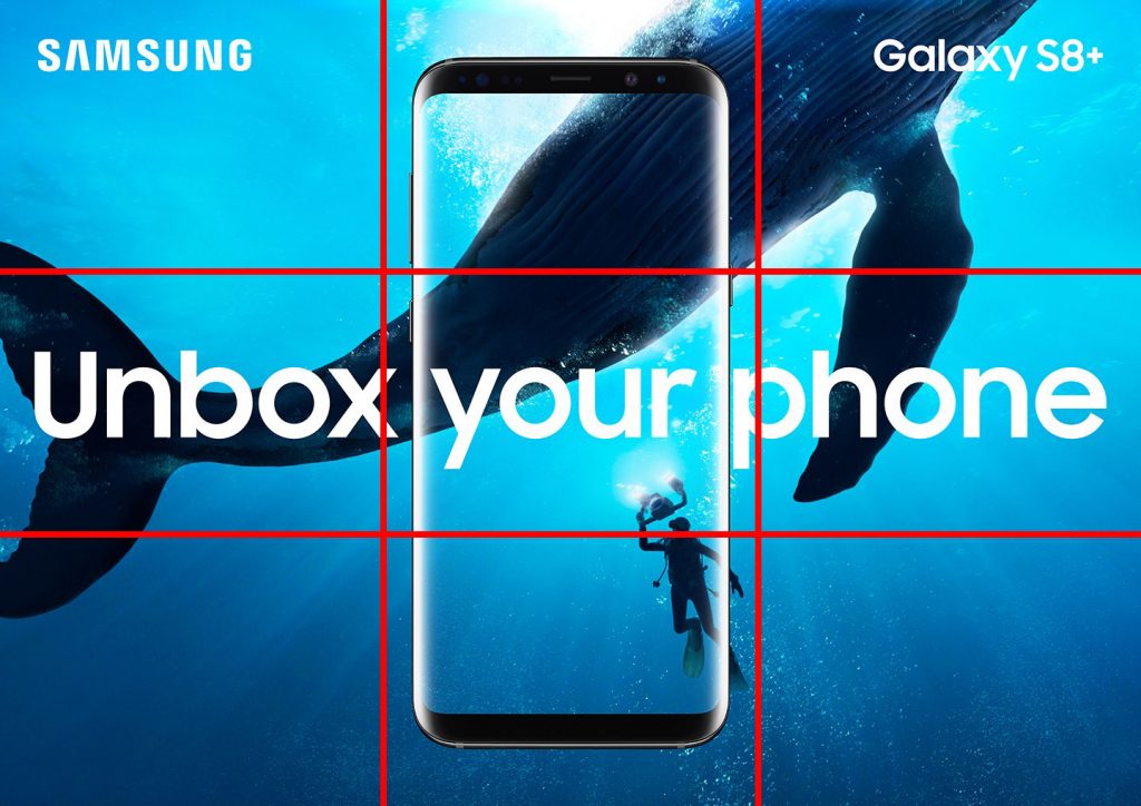
I really like the design of this ad, for me it really caught my attention and while being a more creative ad, still makes it clear what the ad is about. This ad has a fantastic use of the rule of thirds. The wale is taking up 2/3 of the page, centered on one of the thirds mark. The divers face is right at the lower third mark, helping to bring your attention to a much smaller part of the photo. The rest of the design is mostly centered adding some symmetry to the asymmetrical image behind.
Original Ad Color
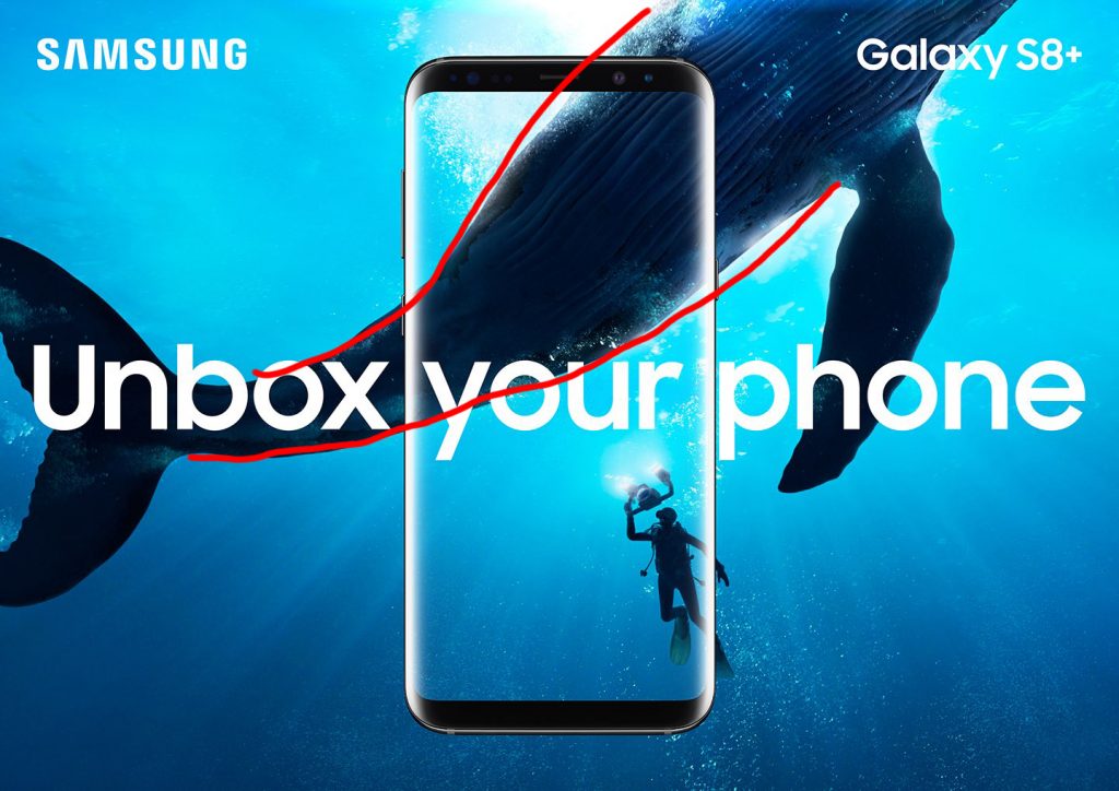
This add is using a very strong blue color theme, all of the image is different shades of blue, with the reflection on the phone and the text popping a bright white. The contrast from the body of the wale to the water brings your eye to the start of the text like an arrow. The diver and the wale being a much darker color than the water around them really helps them to pop and bring attention to them.
Original Ad Typography
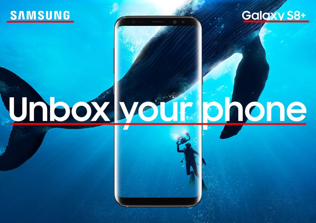
This ad uses a single typeface, however, there is some contract in the size of the font. Both of the upper words are smaller while the main phrase is much larger, making it clear this is the desired point for your eye to follow.
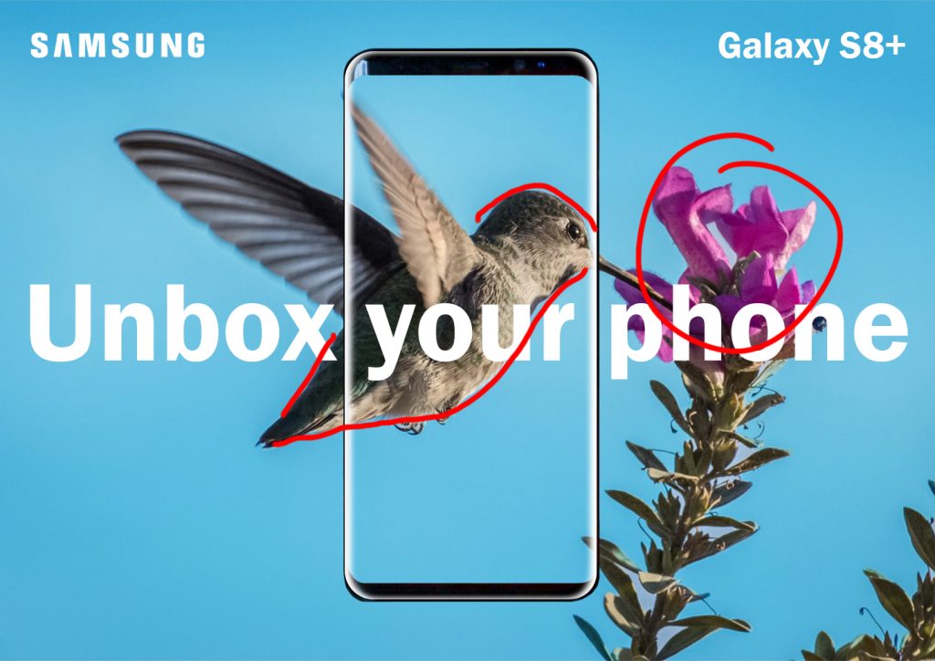
New Ad Design

My new add also has a good use of the rule of thirds, the flower is kept to the right most third. The eye of the bird is sitting at a third line also. The flower and the bird have a high contrast from the background. making them a main focus. The words show groupings based on location, the logo and the device name are in the top corners grouping them in my mind, While the main text is larger and aligned differently making it another group.
New Ad Color
This color follows with a largely blue color scheme, with the flower adding a pop of color to bring your attention in. I did adjust the color of the background to a blue that matched closer to the original ad to make them look more like each other. There is also a high contrast between the dark of the bird and flower, and the light of the sky, making the bird and flower the focus point. The white of the words and the reflection on the phone also pop out and bring attention there.
New Ad Typography
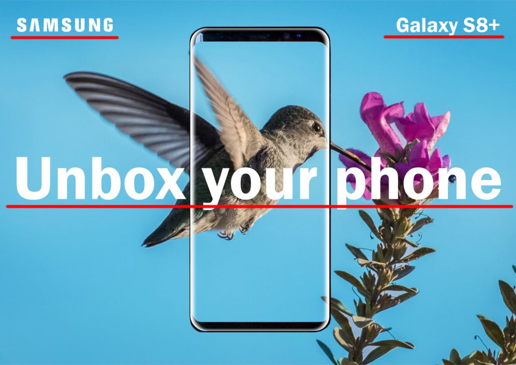
I used as close a typeface as I could find for the main text and the device text though it does have some contrast to the Samsung logo, unlike the original ad. Like the original ad, the different section s of text are grouped based on location. The main text in the middle is larger making it clear it is meant to be the focal point.
Conclusion
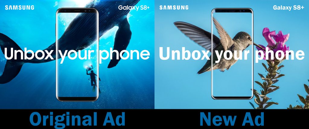
In conclusion, the new ad I created matches well with the original ad as it follows the same color scheme, and the typefaces are very similar. I wanted to keep the background photo as a nature photo but make it a little different by bringing it above land instead of underwater. The text is definitely the main thing that unites the 2 ads and the photos, while similar, offer a good contrast to each other.